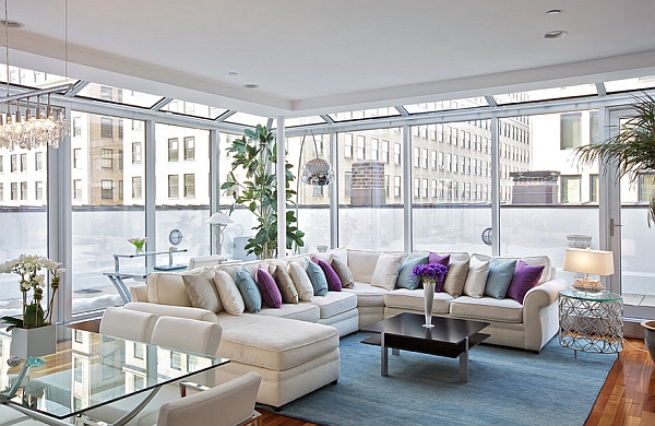
Home interiors that lack color accents are uninspiring places, but by the same token, too much color is overwhelming and can make people feel anxious. That’s why fast food establishments use strong primary colors in their decorating scheme — so that customers move along quickly, providing room for more business. Homeowners don’t want the same effect, though, so it’s advised that they don’t use strong primary colors as the dominant color in the interior decorating schemes.
Here are three tips to help homeowners create an inviting, comfortable indoor living space using color:
60-30-10
This basic decorating rule covers the dominant color in the scheme, the secondary color and the accent color. The unifying, or dominant color, covers the walls, floor, and ceiling. This is usually a neutral tone such as beige or cream, but other colors are sometimes used effectively.
The 30 percent covers secondary items such as upholstery, throw rugs, cute curtains and major pieces of furniture. The remaining 10 percent are accents such as decorative ceramic pieces, flower arrangements, and small, incidental furniture pieces. Accent pieces should be evenly distributed around the room to achieve a balanced effect.

None of the colors in any of the percentage groups need to completely match — in fact, it’s better to use variations within the same color categories. For instance, light, cream colored walls look better if windowsills and doorways are painted with a darker shade of cream.
Color Temperatures
The same principles that apply to clothing and makeup involving color temperatures also apply to home decorating. Keeping colors within the same temperature range creates a better overall look and feel to any given room, and can actually play a part in the room’s comfort level. Those who live in a warm climate, for instance, may feel refreshed and rejuvenated if they return home to an interior space that features soothing blues and whites. Conversely, cold climate dwellers who decorate in warm colors will appreciate the cozy feel these colors impart. There is a good reason why most mountain cabins are decorated in warm colors.
Overall Continuity
Although it’s a mistake to use the same color scheme in every room of the house, continuity between rooms provides a home with an appealing flow. For instance, if one room is dressed in cool blues, violets and whites, while the one next to it features a warm color scheme involving beiges with accents in the yellow-orange range, going from one room to the other is going to be visually jarring. It’s possible, of course, for two rooms in the same home to have completely opposing color schemes, but use of a transitional space can ease the transition. For instance, a neutral hallway between a living room decorated in cool colors and a bedroom dressed up in warm, cozy tones provides a good bridge between the two spaces.
Accents such as decorative throw pillows, ceramics, or wall art can be changed to accommodate different seasons or just a personal need for a change of pace. Experimenting with color and decor can be a satisfying and fun pastime, and homeowners should keep in mind that well dressed homes are constantly evolving.
+Paul Reichman years in home fashion experience have enabled him to offer all your home furnishing and decor needs with unique flare and style at Bedbathstore.com
